To Judge a Front Page
22 Feb 2018We’ve all heard the phrase “Don’t judge a book by its cover.” Yet, this is exactly what we do with each website that we visit, but that’s not necessarily a bad thing. We like the images, the flashy backgrounds, and the vibrant colors. Occasionally, we come across a wall of text with some solid-color background that just happens to also be the most boring or most irritating color in existence. When faced with those websites, it’s almost instinctive to quickly leave without reading the first sentence, even if we’re desperately searching for information. The period where Yahoo! and AOL were popular are over, and the internet of now is (mostly) filled with these visually-pleasing websites.
Back to 1998
CSS Practice Website
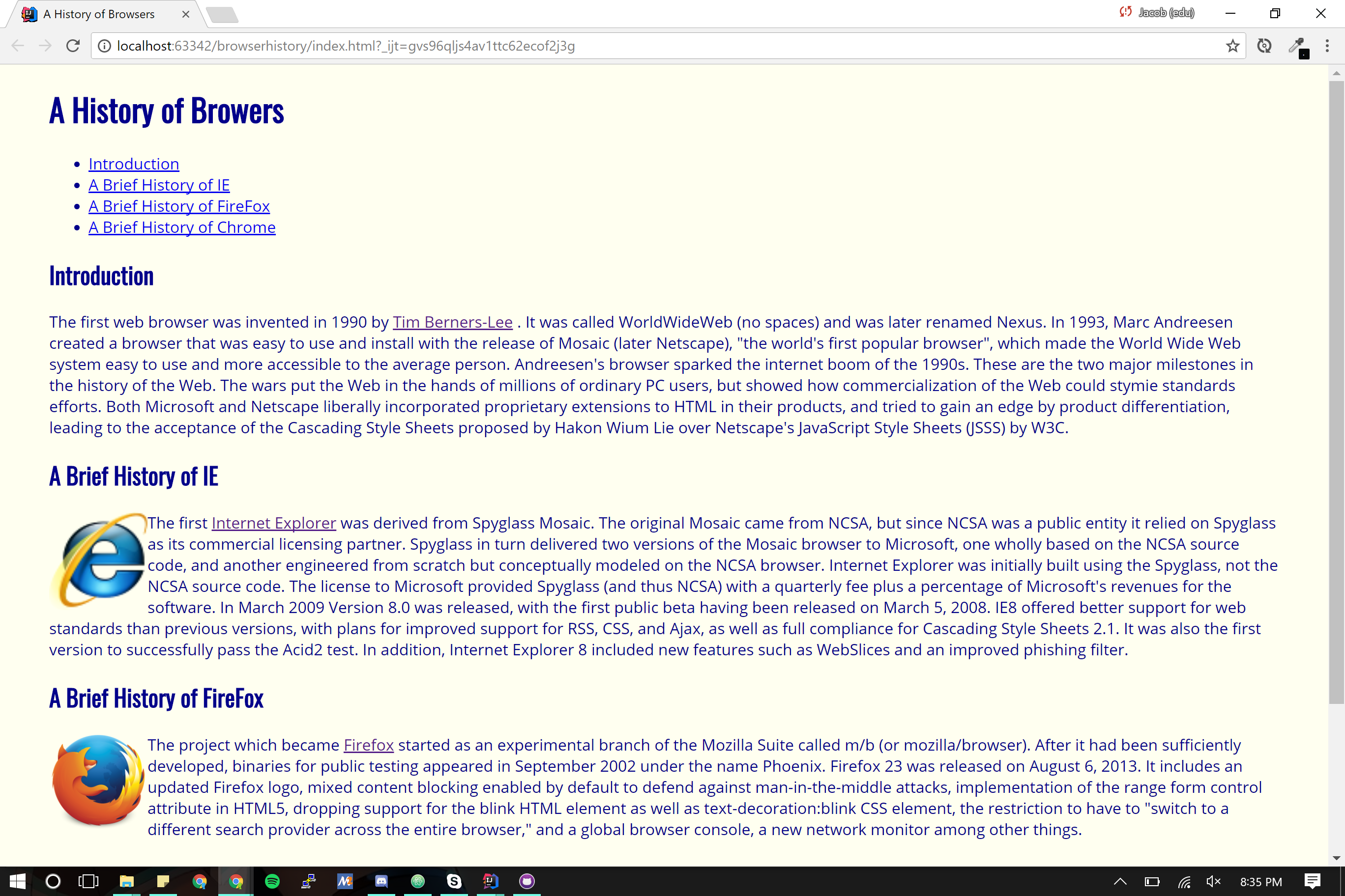
Although newer websites look nothing like what they did even 10 years ago, that doesn’t mean that the old technologies have been phased out. Rather, it is essential for us to understand how those bland websites were made to begin to understand how new websites are made. Using CSS and HTML, we can create extremely basic looking websites.
At the very basics of HTML, there are some essential elements that can be utilized to control the design of the web page. These elements include:
- Paragraph
- Header
- Hyperlink
- List
- Image
Using these elements, we can create web pages very similar to the the most generic site that we can think of. By adding CSS into the mix, we can begin to add styles to change the visual appearance of the website—font color, background color, margins, and much more. This isn’t to say that it’s completely impossible to create a fancy, attractive website, just very difficult being limited to such few elements.
So why not just stick to CSS and HTML if it’s possible to create similar, just-as-nice sites? Because we can do it better using UI Frameworks with more functionality and more control. It’s easy to make a generic wall-of-text site with HTML and CSS, but in our modern lives where we go 100 miles per second, the information we are looking for needs to be easily accessible and delivered on a silver platter. We can still do that using just HTML and CSS, but why go through the trouble of working with only a handful of tools when there’s a shiny, new, fully-equipped toolbox ready to do the job.
Beautiful and Difficult
Programming languages take years to master, and UI Frameworks are no different. Learning Semantic UI for a week, emulating pre-existing sites becomes a feasible task. However, understanding what does what and what goes where can be the frustrating part.
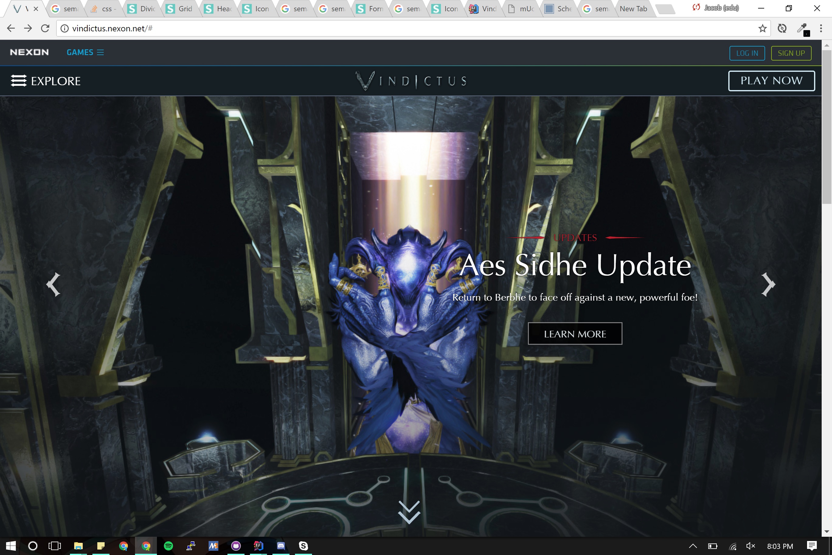
Official Website
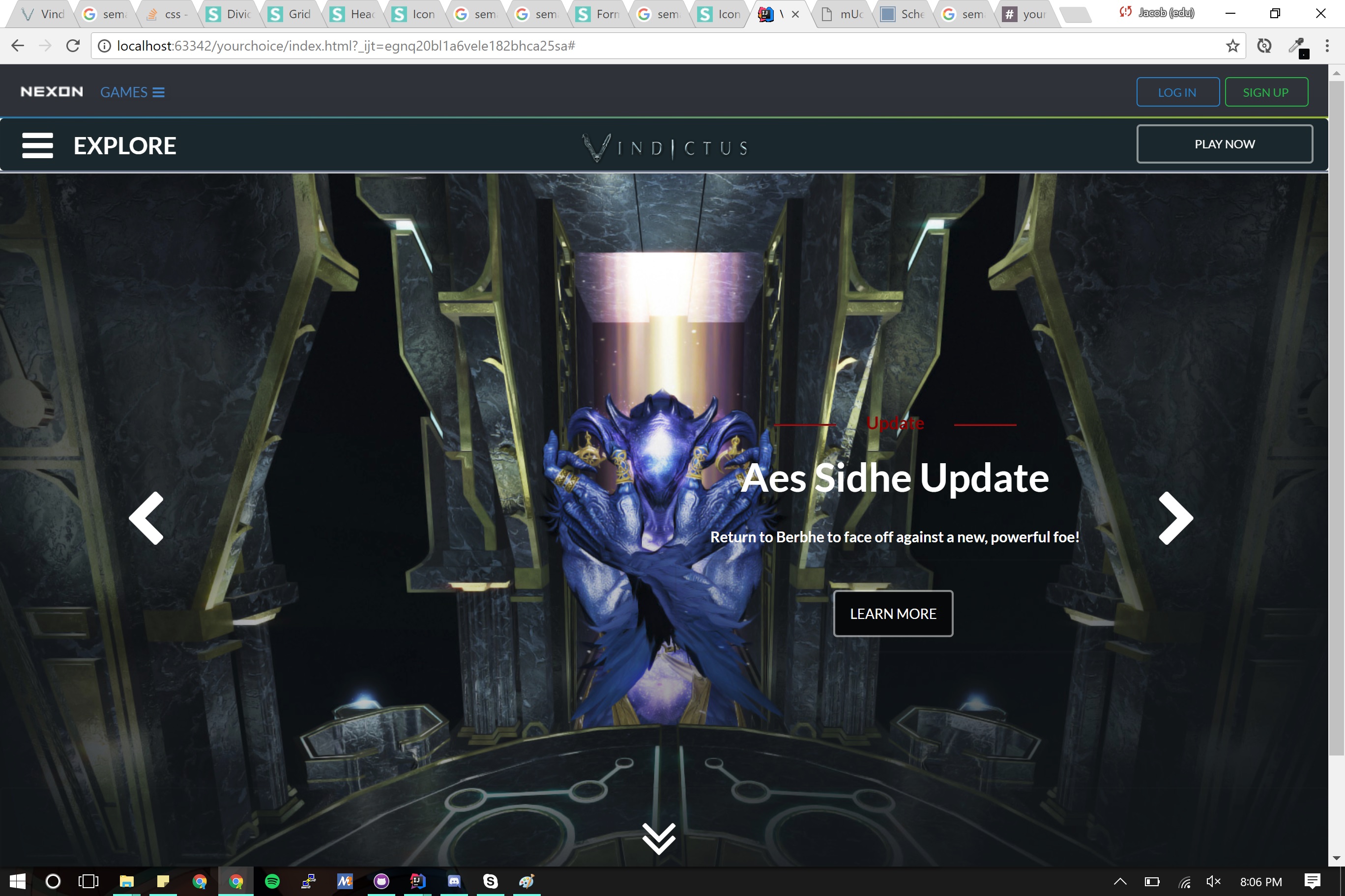
Mockup Website
Sometimes the section of the page don’t sit where you want them to, or appear where you think they should, to fill the space like you planned. Additionally, the syntax or terminology used for one element may not be standard for another. Centered and center aligned implies the same thing, but one works for images and the other works for headers. In that sense, it feels very nonsensical for it to be that way. Why can’t it just be one of the two? The same is true for sizes. I can’t say why it chosen to be this way, but it is how it is.
Beside the struggling and frustration I went through to learn Semantic UI, there are a lot of up-sides to what it can provide to a website. Since an element can be change based on the class you give it, there are a lot of possible combinations to create unique elements. For instance, a ui red button and ui red basic button are two different-looking elements. The former is a red-colored, white-text button, and the latter is a red-outlined, red-text, clear button. Additionally, elements can have different behaviors that what is available in CSS and HTML. We can have elements no bound to the page like navigation bars than follow as the user scrolls, dropdowns, inputs, loaders, and much, much more. Utilizing each element to its fullest, it’s possible to re-create the all the websites that are made grab our attention, or even create another amazing website for ourselves.
Always Something Better
After learning CSS, HTML, and Semantic UI, I really wish I had known these during the
Android app
project. Since I struggled to make a eye-pleasing design during the project, maybe knowing these would’ve been helpful. Once we started CSS and HTML, I recognized terms like margins and padding, and had a general sense of how designing using CSS, HTML, and Semantic UI would be, but it was a lot more in-depth than I expected.
As always, we can’t always have the best, nicest, or newest things (unless we are the ones making them), and UI Frameworks are no different. Although Semantic UI has been extremely useful to us for making websites that look like the ones we’ve started to see everyday, it is not the only UI Framework that exists. From HTML and CSS, we went onto learn Semantic UI. After learning Semantic UI, up next is the React version of Semantic UI. Hopefully, not as much of a struggle, but it’ll be interesting to see how much easier or better React can make the websites we’ve made throughout this past week.